In the dazzling world of digital marketing, the landing page layout reigns as the ultimate style statement. Picture it as the runway for your brand’s message – where visual appeal, functionality, and user experience seamlessly sway together. The importance of a well-designed layout cannot be overstated. It’s the captivating cover of your digital book, inviting visitors to take a deeper dive.
A stellar landing page is the art of digital seduction. It must captivate, engage, and ultimately convert visitors. Simplicity is key; an uncluttered design with a clear and compelling headline draws attention. Succinct, persuasive copy and a focused call to action (CTA) guide visitors towards your intended goal.
Visual elements, such as high-quality images or videos, infuse life into your page, while responsive design ensures it’s accessible on all devices. Social proof in the form of testimonials or trust symbols build trust, and an intuitive navigation system makes it easy for visitors to explore further.


High-Quality Images and Videos: Use visually appealing and relevant media to enhance your message. Ensure they don’t slow down your page’s loading time.
Compelling Copy: Craft persuasive, benefit-oriented copy that explains how your offer solves a problem or fulfills a need.
Use subheadings, bullet points, and short paragraphs to make your content easily scannable for visitors who might not read everything.
Incorporate psychological triggers like success stories from satisfied customers, the fear of missing out (limited-time offers), and endorsements from industry experts. These subtle tactics can have a profound impact on decision-making.
Page Load Speed: Optimize your page for quick load times as slow pages can lead to higher bounce rates.
Strong Call to Action (CTA): Make your CTA prominent, action-oriented, and compelling. Use actionable verbs like “Get Started” or “Request a Demo.”
Remove unnecessary navigation links, extraneous content, and visual clutter that might divert attention from the CTA.
Form Optimization: If your landing page includes a form, ask for only the essential information, and use a clear and concise design. Consider reducing the number of fields to increase conversions.
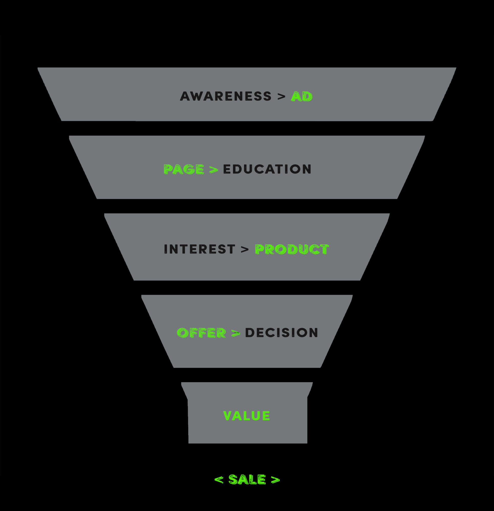
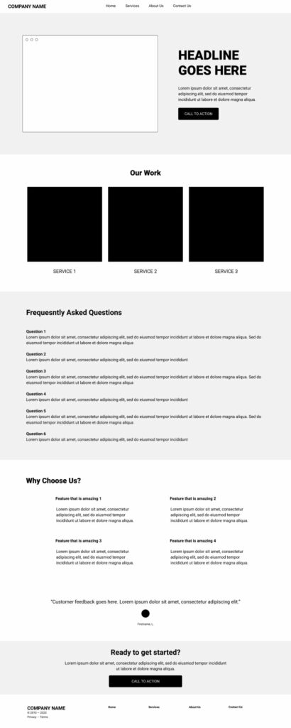
We start with a wireframe – this allows us to line everything up in sand before we start laying the foundations. Once we have the funnel layout, we design imagery to suit each section of the page. Approve these images with our compelling Copywriting and whallah..
Your new page is born within 7 days

To generate reviews consistently, we have an automated approach that automatically requests a review from every new customer. If you are looking to automate the increase of your reviews, this tool will relinquish the need to manually send review links and ensure your business gets timely feedback from both new and existing customers.
Need help with implementing these tips?
We Smash New Revenue Targets for Multi-Location Businesses using Google and AI